TE7 - Point of care Ultrasound
Mindray Biomedical
Role: Design Director, UX, ID
Background
Ultrasound is no longer the sole domain of radiology departments and sonographers. Clinicians from a broad range of specialties have adopted the use of ultrasound to directly visualize anatomy, to perform difficult procedures more safely, and to diagnose disease or pinpoint trauma. Perhaps most importantly, these clinicians are using ultrasound right where they need it; at the "point of care" (POC).
The TE7 is a touch-screen ultrasound device with a gesture based interface and it's purpose-built from the ground up for the Point of Care User.

The Challenge
The design team was given little direction at first and mandate to base the hardware and software off of an existing portable system with a clam-shell design.
With no experience in an emerging market we set out to deliver a mobile device with an “iPad like” experience that could outperform two established major brands.

Research
Internal
Definition of Use Cases by clinical team
Acquisition and Review of competitive device training material, operator and service manuals
Development of a research plan
Market & Competitive Product
Ultrasound Training
Marketing and Clinical Specialist Interviews
External
Target Market - Site Visits (Trauma / Anesthesia)
Observation
SME interviews

Ultrasound machines quickly get messy from gel and other fluids. Having Sani-Wipes handy is key to keeping the machine sanitary. Clinicians jury-rigged a holster for their sank-wipes (left). New users often have a hard time remembering the operation of the ultrasound system. Someone marked the important, frequently used keys on this system as a memory aid.

Clinicians in this emergency room typically used 4 different probes but had to build their own holster for the "endo" probe. In the right image one probe cable had been wrapped in electrical tape due to damage sustained while it was dragged under the caster. A lengthy home-made user-guide was tethered to the device.
Research Insights
UX
Most consoles employed a dizzying array of controls, the majority of which went unused by Point of Care practitioners who did not benefit from their system's advanced functionalities.
With rare exceptions, our users limited their image adjustments to Depth and Gain. This meant that numerous options typically presented on the top layer of existing system's UI's were going unused by a majority of users.
Most users had limited (if any) formal training.
User's created jury-rigged solutions to make their existing machines suit their needs.
Quick Start / Help Guides were created and affixed to the machines.
Brightly colored tape was placed over key controls as a memory aid for novice users.
ID
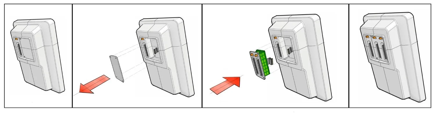
While some of our users needed a single probe for their imaging needs, our primary target market required as many as 3-4 probes to perform their work. This contrasted with our marketing requirements and ultimately changed the design concept.
Users needed to operate their machines in both sitting or standing positions. Their existing machines where optimized for one or the other and were very often difficult to adjust.
At times the machines would need to be maneuvered into tight spaces such as the space between a curtain and a patient gurney. This could be as small as 22" in width.
Transducer gel would often be splattered on the device and it's screen (a concern for a projective capacitive touchscreen).
User's created jury-rigged solutions to make their existing machines suit their needs.
Custom housings covering USB wifi dongles to prevent theft.
PVC tubes attached with pipe clamps to house a 4th (gynecological) probe.
Saniwipe containers lashed to columns.
Telescopic rolling stands bolted into extended positions to prevent transducer cables from being caught up in the device's casters.
Users often failed to charge machines between cases.

Preliminary Concepts

Whiteboard sketches of potential hardware configurations.
Armed with our in-house knowledge and outside research the team set about preparing a rough concept that would be presented to our stakeholders before beginning development in earnest. The goal was to provide a clear understanding of the key elements of the concept before the larger team became engaged. This included rough concepts for the user interface and the structure and components of the hardware. At this point UX and ID teams are working very closely to address questions of screen orientation as well as interaction methods and hardware.

Early Sketches starting to consider overall architecture and challenges
Concept Development & Early User Testing
A quick sketch model was created as early as possible to clearly communicate the system structure, its various key components and operation. Its crude appearance keeps conversations from straying into aesthetic preferences and focused on functionality and features.

A preliminary ID mockup and a prototype UI are user tested to help refine the design direction.

Design Development
Throughout the project the ID team made extensive use of hand sketching, physical mockups, CAD models and rapid prototypes to communicate concepts to mechanical engineers and stakeholders.